Have you had some work done?
Hitting certain age milestones has a tendency to inspire reflection. Sometimes that includes the very literal reflection of staring deeply at our faces in a mirror, questioning: does the person staring back really show the world who we are now?
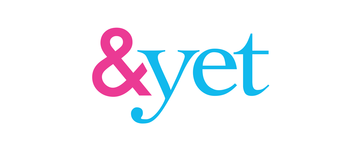
2018 marked 10 years of existence for &yet. Suddenly we found ourselves reflectively daydreaming about ways we might spruce up this older, wiser double-digit version of ourselves. Why not give our decade old logo a mini-facelift?
Our old logo has been with us since the beginning. It was a quick restyling of something one of our founders came up with (see below). Once we created it, we just ran with it and never really looked back. But after a good, long look in the logo mirror (can logos look at themselves in the mirror?) we saw some clear improvements we could make without completely overhauling everything and doing a total rebrand. (We’ll save that for our next big birthday 😉).
Ch Ch Ch Ch Changes…
The main issue with our old logo is weight balance. On the left, we have our “&,” a bold sans-serif character with virtually no contrast (a font’s “contrast” is the difference between the thinnest and thickest parts of the letters. No contrast means all parts are a uniform width). On the right, “yet” is spelled out with dramatic serifs (those little letter “feet”) and a lot of contrast.
So what did we do to make these two parts feel more harmonious?
Balanced Weight & Contrast
We thickened the characters on the right until their thickest portions were the same width as the uniform thickness of the ampersand. This helps the two halves feel more unified.
![]()
Shorter Serifs
Shorter, chunkier serifs pair a bit nicer with the bold san serif ampersand. Plus they just look better on a logo.
![]()
Softer Corners all around
Rounding the corners just felt a little more polished and added to the more unified feeling between the two logo parts. We softened both the inner and outer corners, making everything nice and smooth.
![]()
Adjustments in spacing and height
We evened out some of the letter spacing and played around with the some of the letter heights until we landed on something we thought felt more pleasing to the eye.
![]()
![]()
Our new logo has been deployed across our internet presences, ready for an exciting 2019. We hope you like it as much as we do.
What changes are you hoping to make this year?
--
Bonus Content
&yet’s short lived, but true first logo, created by our founder Adam Brault, before he teamed up with Amy, who helped, uh, calm it down.
![]()