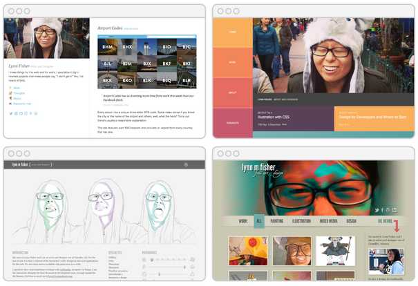
Over the past ten years I’ve made ten different versions of my website. I call it my annual portfolio “refresh” since the content usually stays the same. I do always start with a blank CSS file.
 some past iterations of lynnandtonic.com
I do this each year for a few reasons:
- to ensure I’ll complete at least one non-work project
- to experiment with and learn new techniques (a few standout refreshes were my first attempts at responsive design, flexbox, and this year, CSS grid)
- a year is about the right amount of time for a version to exist where I don’t feel sad once I sit down to change it
Also, a truly great thing about redoing my own site is that it’s fully mine and I can do whatever the heck I want. 😊
A very small percentage of my portfolio’s visitors are airport enthusiasts, Top Chef viewers, and family (hi, mom). But the primary audience is overwhelmingly web designers, developers, and tech recruiters. These are people who know how websites are built and might take an extra minute to inspect things. I wanted to design around that.
Concept and inspiration
For years we’ve been telling the world that a website doesn’t need to look the exact same in every browser for every user. With responsive design and progressive enhancement, users will see things differently. Not everyone needs to experience the entirety of the site.
But could I make people want to experience all of it? Could I surprise them by taking these concepts to an absurd extreme?
I love to resize my browser and see how the layout responds and how the designer decided when things change and what gets dropped or added. I know lots of other people do this too. I initially thought I could subvert expectations by making the ubiquitous phone, tablet, and desktop breakpoints trigger completely different layouts with unique styles, colors, and type treatments. Three sites in one.
The changes, as dramatic as they might have been, still felt too conventional. You already expect something to happen at tablet size and then again for phones.
I’d recently watched a YouTube video about the Kuleshov Effect, a term in film editing that describes “a phenomenon by which viewers derive more meaning from the interaction of two sequential shots than from a single shot in isolation.” A metaphorical bell chimed in my head.
There’s preexisting meaning for a site to have three (or a few more) distinct layouts: supporting common devices. But what would it mean for there to be 10, 15, or ultimately 21 distinct designs that “sit” side by side for you to discover one at a time, one after the other. Each one may be unremarkable on its own, but it’s the relationships (and differences) with the ones to the left/right and to the 18 others that make each one worth looking at.
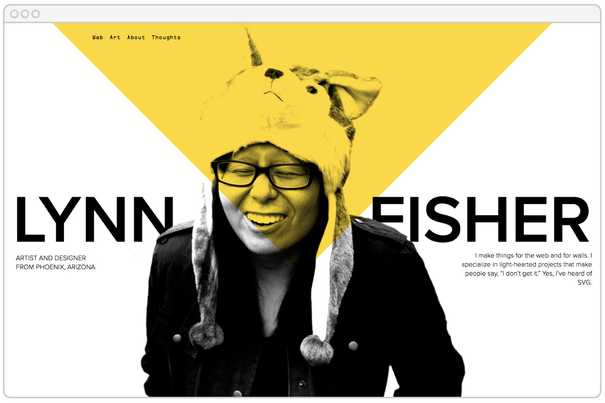
 A preview of lynnandtonic.com
Executing the idea
I already knew it was possible to use CSS to turn basic markup into something extraordinary. CSS Zen Garden showed us this repeatedly for years. Another side project of mine, a.singlediv.com, takes this concept to ridiculous extremes (I sense a pattern here).
So executing this redesign started with basic HTML. One thing I’ve learned over the years of experimenting with CSS is you can achieve a lot without needing to sacrifice clean markup.
Here’s what I landed on. The <span>s inside of the <h1> and <p class='intro'> would allow me to style each line differently if I needed and the <picture> element would allow for a responsive image plus provide additional :before and :after pseudo-elements (which <img> doesn’t allow).
<body class='home'>
  <nav class='main-nav'>
    <a class='nav-home' href='/'>Home</a>
    <a class='nav-web' href='/web'>Web</a>
    <a class='nav-art' href='/art'>Art</a>
    <a class='nav-about' href='/about'>About</a>
    <a class='nav-thoughts' href='/thoughts'>Thoughts</a>
  </nav>

  <h1>
    <span class='name'>Lynn Fisher</span>
    <span class='desc'>artist and designer from Phoenix, Arizona</span>
  </h1>

  <p class='intro'>
    <span>I make things for the web and for walls.</span>
    <span>I specialize in light-hearted projects that make people say, “I don’t get it.”</span>
    <span>Yes, I’ve heard of SVG.</span>
  </p>

  <picture class='lynn'>
    <source srcset='/assets/images/lynn-small.png' media='(max-width: 1400px)'>
    <source srcset='/assets/images/lynn.png'>
    <img src='/assets/images/lynn.png', alt='a photo of the artist'>
  </picture>
</body>
Also I guess I should add a disclaimer here. I’m the only one touching this code so I set things up the way that worked for me. Of course there are different and surely better ways of doing all of this. 🙂
I use Stylus for CSS preprocessing (and will in the following examples). I first created a home.styl where a reset and variables would be imported, basic page styles would be declared, and where the media queries would be set up. It, plus the other pages, would import into one main.styl that gets compiled and minimized. The structure looks like this:
📁 _styl
  📁 components
  📁 globals
  📂 pages
    📄 about.styl
    📄 home.styl
    📄 thoughts.styl
    📄 work.styl
  📄 main.styl
I planned on using CSS grid for this redesign, so I created a super basic fallback layout to show by default (separated into its own file in a home directory) and I placed everything else inside a @supports declaration.
📁 _styl
  📂 pages
    📂 home
      📄 fallback.styl
    📄 home.styl
  📄 main.styl
/* home.styl */
@import 'home/fallback'
@supports (display: grid)
body.home
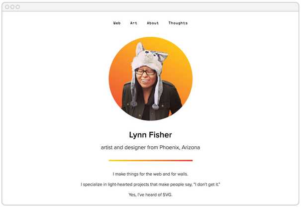
[base styles here]If a browser doesn’t support display: grid it will render the fallback, which looks like this:
With a fallback in place, I could now focus on the many different layouts. To keep things manageable, I split up each layout into its own file alongside the fallback.styl in the home directory (don’t mind my ridiculous naming).
📁 _styl
  📂 pages
    📂 home
      📄 b-and-w-and-gold-all-over.styl
      📄 big-nav.style
      📄 big.styl
      📄 blockhead.styl
      📄 bolt.style
      📄 cutout.styl
      📄 diagonal.styl
      📄 disguise.styl
      📄 fallback.styl
      📄 fifty-fifty.styl
      📄 half.styl
      📄 L-Y-N-N.styl
      📄 landscape.styl
      📄 movie.styl
      📄 pop-out.styl
      📄 rotate.styl
      📄 stranger.styl
      📄 third.styl
      📄 triangle.styl
      📄 white-bars.styl
      📄 white-box.styl
      📄 x.styl
    📄 home.styl
  📄 main.styl
Then I was able to import each layout into its own media query:
/* home.styl */

@supports (display: grid)
  body.home
    [base styles here]

  @media screen and (max-width: 400px)
    @import 'home/diagonal'

  @media screen and (min-width: 401px) and (max-width: 500px)
    @import 'home/L-Y-N-N'

  @media screen and (min-width: 501px) and (max-width: 600px)
    @import 'home/blockhead'

  + 18 more (2300px being the widest media query)
This removes any collisions that might happen and eliminates the need to do massive overrides. There is some repeated styling across various layouts, but I found that acceptable to keep things clear and organized. Each breakpoint is only using the CSS it needs for its specific layout.
Further learning
If you’re interested in digging into the CSS a bit more or to inspect individual layouts, I made my repo public on GitHub. 🙈
I won’t go into how to use grid here as Rachel Andrew and Jen Simmons have written and spoken extensively on the topic. See Rachel’s Grid by Example and Jen’s Experimental Layout Lab as good places to start.
Patrick Brosset of Mozilla created a video breaking down the use of grid for one of my site’s layouts which is pretty cool:
I planned on elaborating on some of my favorite parts of the redesign here, but I think I want people to be surprised as they explore. So if you haven’t checked it out yet, please do at lynnandtonic.com.
Response
I always hope my work will inspire people to think about their medium and tools differently and to encourage them to experiment with what’s possible.
The response has been overwhelming and it’s truly wonderful to see people discovering and enjoying the site. I’m so grateful for everyone’s kind and encouraging words.
One piece of feedback I received is that a lot of people don’t resize their browsers at all. That’s true! And it’s totally okay. The site is still functional even if you don’t know any of the other layouts exist. Well, to be fair, there is one layout that would make for a super confusing experience (Stranger Things fans might know which one I’m talking about). But with my audience in mind, I figured risk was low.
With most of my work, there are people who ask “Why do this?” I have another post in the works that dives into the many reasons, but for now: sometimes it’s fun to do things that are weird.
Thanks for checking out the site. It means the world.
Until the next redesign,
<3 Lynn
