A piece of recurring feedback we’ve received is that the Talky web interface isn’t great for smaller screens, especially for those on Android mobile devices. There is a Talky iOS app, but there isn’t one yet for Android, and the web interface was designed for wider (desktop-sized) screens.
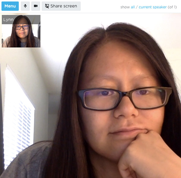
With the latest release, we’ve taken that feedback and designed a better experience for small screens. Our primary goal was freeing up screen space for the video streams. We changed the wide sidebar to a much shorter top navigation, but keeping the primary controls readily available. To gain back some space, we moved the less-frequently used controls into an expandable menu and removed the secondary roster of participants.

While these changes were made with mobile devices in mind, you can also see them on your desktop browser. Resize your browser window and free up some of that monitor space.
Check it out now at talky.io and let us know what you think! Or tell us what other features you’d love to see added to Talky.